After my interim crit with Ria on the 17th November, it was time to tackle Task 3 on the list. Time to look at my current crop of images taken over the last few weeks then select the ones that are the most effective & striking, both visually and technically. I will then get a selection of basic prints done so I can look at them off the screen. Will also be easier to look at & make groupings.
My first editorial decision was to use the photos taken on Brighton Beach. I did like some of the ones from Beachy Head & the Seven Sisters Country Park, but they were not as visually strong both in composition & technically in comparison. I think that if I was to take more successful shots of these locations, I would need many more visits to work out when the best light would be. Also, I would have to use a lens with a wider angle & deeper focus to make the most of that snaking river at Seven Sisters.
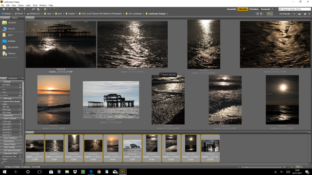
I then went through the Brighton Beach collections, marking the ones I thought were the stronger images. I also wanted to include the ones which I felt related to my findings while researching the work of other photographers, specifically Ansel Adams, Fay Godwin & Thomas Joshua Cooper. I rated them accordingly, giving a top ***** to the ones I thought best.

I then copied all of the RAW files into one folder then took a much closer look at the quality of the images. As I wanted to emulate the sharpness seen within a black & white print, all images with visible ‘noise’ were rejected. Next, I looked at the colour tones to see what matched. I was finding myself drawn to the more monotone ones, rather than the ones featuring blues & oranges.
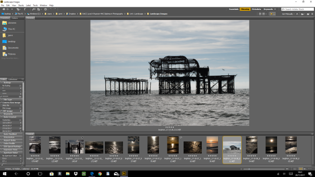
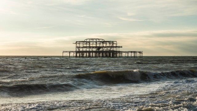
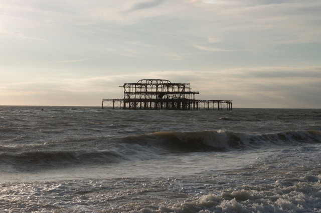
So I started to mark these down removing ones that didn’t have the right composition, such as the one featuring the concrete pier. It did have some nice leading lines, but it didn’t quite fit in with the others. I also remembered my original concept of making water ‘look like rock’.
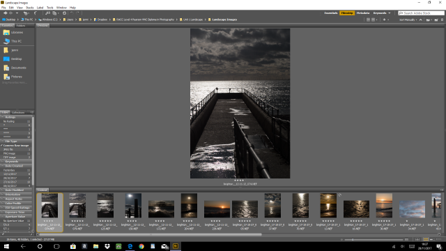
Again, more images were taken out. I found myself being more fussy & cut-throat at this stage. Even removing some of my favourites.
This is how the final selection looked.
These are the jpgs:
At this stage, I had decided that black & white was the way forward. I’d always envisioned the final image as monotone. Especially as the three landscape photographers’ work I’d looked at are too. So I tried a few test conversions on one of my selected images.
My next thoughts were on cropping. One observation of Adams’, Godwin’s & Coopers’ work is that they are rarely on a 2:3 ratio. They seem to be 3:4 or 4:5. Also, the frames I have in mind have a mount size of 16″ x 12″ (3:4) rather than 12″ x 18″ (2:3).
I find that the ratio of 3:4 & 4:5 gives a more intimate feel to a picture & brings the viewer into the scenery. This is an effect I want to highlight in the images, which also reflects the shorter depth of field & ‘tightness’ in a photograph taken by my 50mm lens.
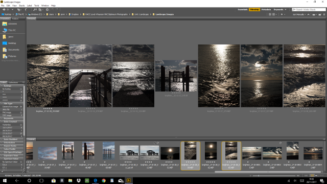
After going through some further black & white conversions then cropping them, I settled on the following six images to send to print:
Two days later, the prints arrived. I’ve played around with various combinations & this seems to be the leading choice at the moment:

My next step is to bring these prints into college on the 24th November to show to the class & Ria for their thoughts & critiques. There is still a lot of work to do, too. I know the editing on these images could be greatly improved. The contrast isn’t quite right on the final prints compared to how they appear on screen. I need to think about the paper they’ll be printed onto as well & how editing can make the most of my final choice of medium. Lots of questions to be asked. Lots more analysis, too.
Criteria Ref: Tasks 2.2, 3.1, 3.2 & 4.1


")
")