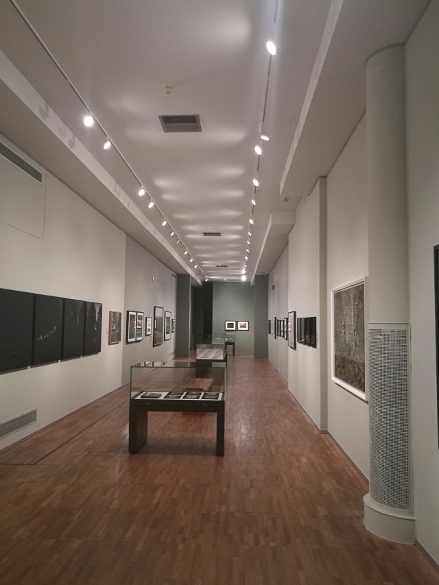
After going through the unit’s aims & scenario, it was time to take a visit to the V&A South Kensington. I hadn’t visited for a while so it was great to revisit this wonderful museum. The purpose of the visit was to take a look round to kick off my initial research, hoping that something would ‘jump out’ & provide those initial grains of idea inspiration.
The one exhibition I really wanted to take a look at was Into The Woods: Trees in Photography. What I did discover is that trees were among the first photographic subjects collected by the V&A as a learning resource for artists and designers. The museum has acquired, & continues to do so, “photographs of trees in various contexts: within landscapes and forests, as lone subjects, in relationship to humans, in rural and urban settings, and as symbols of cultural significance.” (V and A, 2018).
Trees are a particular favourite subject of mine & have proved to be a major wealth of inspiration in my own work. I was certainly not disappointed. From the sepia-toned photos of Edward Fox to the delicate & inventive work of Tokihiro Sato, this was an inspirational collection of work that was a real pleasure to see first hand.
Just a bit of a shame it was tucked away in a narrow gallery. Minor detail. Onto the photographs.
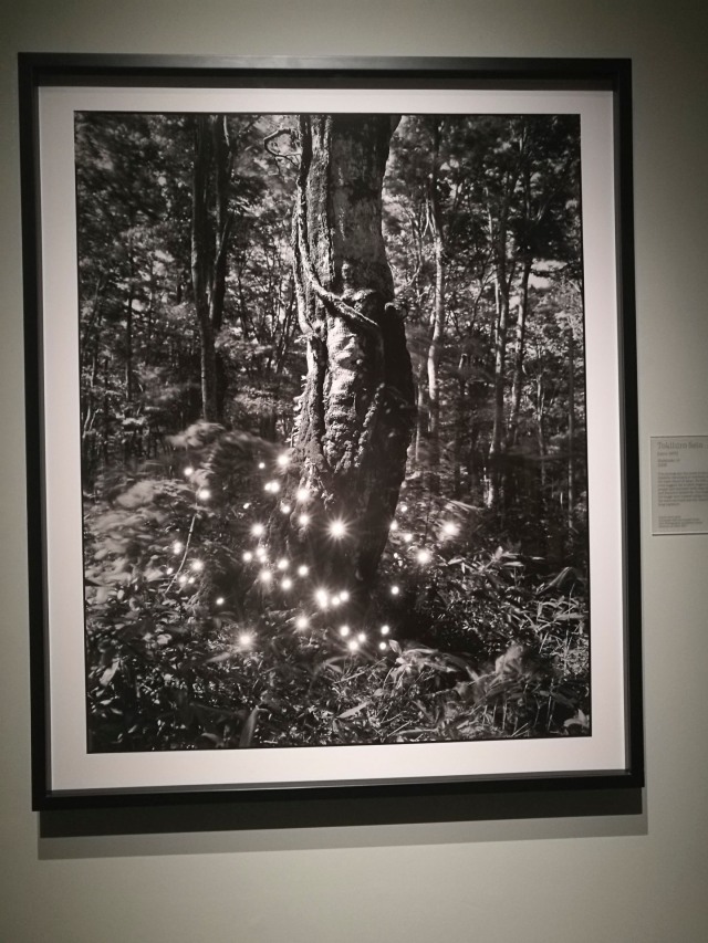
Tokihiro Sato
The first work as you walk into the gallery is a piece by Japanese photographer Tokihiro Sato. He created the bright spots in the image my using a mirror to reflect the sun’s rays back into the camera during a long exposure. As for his motives behind the image, these beech trees suggest the ancient origins of the Japanese people & represent both masculine strength & female sensitivity.
As the image is a long exposure, the tree itself is highly detailed while the surrounding foliage is slightly blurred due to its movement during the exposure. One could take desipher this that the ancient origins of the Japanese will always remain a constant within the country’s culture despite the passing of time & changing external influences.
Here is a selection of the other works on display, including those by:
Aaron Siskind
Abbas Kiarostami
Agnes Warburg
Alfred Stieglitz
Alvin Langdon Coburn
Ansel Adams
Awoiska van der_Molen
Bae Bien U
Benjamin Brecknell Turner
Denis Brihat
Edward Fox
Edward Steichen
Henri Cartier Bresson
Jerry Uelsmann
Johann Carl Enslen
Mark Edwards
Michael Kenna
Neil Drabble
Oscar Louis Forel
Phillip Jessup
Sheva Fruitman
Simone Nieweg
Sophie Rickett
Stephen Shore
Tal Shochat
Veronique Rolland
Aaron Siskind
Aaron Siskind
Abbas Kiarostami
Abbas Kiarostami
Agnes Warburg
Agnes Warburg
Alfred Stieglitz
Alfred Stieglitz
Alvin Langdon Coburn
Alvin Langdon Coburn
Ansel Adams
Ansel Adams
Awoiska van der Molen
Awoiska van der Molen
Bae Bien U
Bae Bien U
Benjamin Brecknell Turner
Benjamin Brecknell Turner
Benjamin Brecknell Turner
Denis Brihat
Denis Brihat
Edward Fox
Edward Fox
Edward Steichen
Edward Steichen
Edward Steichen
Henri Cartier Bresson
Henri Cartier Bresson
Jerry Uelsmann
Jerry Uelsmann
Jerry Uelsmann
Johann Carl Enslen
Johann Carl Enslen
Johann Carl Enslen
Mark Edwards
Mark Edwards
Michael Kenna
Michael Kenna
Michael Kenna
Neil Drabble
Neil Drabble
Oscar Louis Forel
Oscar Louis Forel
Philip Jessup
Philip Jessup
Sheva Fruitman
Sheva Fruitman
Simone Nieweg
Simone Nieweg
Sophy Rickett
Sophy Rickett
Stephen Shore
Stephen Shore
Tai Shochat
Tai Shochat
Veronique Rolland
Veronique Rolland
There are a few other pieces that caught my eye & imagination, such as Jerry Uselmann’s surrealist shoots. I’m not sure at this stage whether this will be relevant to the current project, but am very glad I went to see this exhibition of tree photography.
What I did find pertinent to this unit that the majority of works on display were single pieces. As I have to only produce one or two final images, its something to think about. There were a few series of twos & fours, but there were very tight in their combination. For example, Veronique Rolland’s quartet featuring the same yew captured at the four seasonal peaks of spring equinox, summer solstice, autumn equinox & winter solstice. Each image has it’s own quality of tones & light, but the subject itself is exactly the same.
Having visited this exhibition, it was time to explore some of the other parts of the V&A.
During my recent visit to the V&A recently, I took note of the following pieces. They include mosaics, circular items, silver bowls, stained glass & glass.
Tigress Lying Below Rocks
cof
cof
Table with ‘Twenty four Hours in Rome’
sdr
cof
cof
Clutch Bag – Michelle Oka Doner
cof
dig
Silver Bowl – Adi Toch
cof
sdr
cof
Tazza The Four Seasons – Jane Short MB
cof
cof
dig
dig
Stained Glass & Circles
dig
sdr
sdr
sdr
Icthy’s Font – Colin Reid
sdr
cof
cof
mde
Lamerti – Martina Angius
cof
cof
At this stage of the creative process, I wasn’t not sure of the direction I would be taking. I have to admit that nothing really caught my imagination. I needed to either revisit or find further inspiration elsewhere.
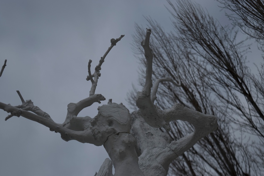
I recently had a trip to Rome during which I visited the Maxxi, the Italian National Museum of 21st Century Arts. Designed by the architect, Zaha Hadid, this is an impressive building that in itself is a wonderful piece of construction.
One item on display that did catch my eye was this work by Ugo Rondinone.
Winter Moon 2012
This is an aluminium cast of a tree that’s coated in white varnish which was on display outside the museum. It is one of a series called Winter Moon, 12 casts of century-old olive trees found in Puglia & Basilicata. As stated on the accompanying plaque, the artist’s inspiration behind the pieces is to “tread the path between nature & artificiality, reality & fiction, and displays a sort of petrified nature, which can be considered as a monument and transcends place, space & time. This aesthetically shocking piece enables the artist to deepen the link between what is real & what is artificial.”
During my recent visit to Rome, I also had the pleasure of visiting many museums & churches plus exploring the city. This included the Vatican Museum (including the Sistine Chapel), St Peter’s, the Maxxi, the Palazzo delle Esposizioni, Complesso del Vittoriano & the Museo Nazionale Romano. Works on display included those of Claude Monet, Piero Fornasetti, Edward Munch, Leonardo Da Vinci, August Rodin, Gian Lorenzo Bernini & Caravaggio.
From cutting-edge digital imagery to expertly carved marble hundreds of year old, there was just so much to see & absorb within this culturally rich metropolis. Trying to write up every single aspect of discovery was, at this stage in the creative process, quite a task. I was hoping that once I started filtering my discoveries, certain aspects would present themselves. In the meantime, here is a selection of my photos from my visit.
Vatican Museum
cof
cof
cof
cof
cof
cof
cof
cof
cof
Gian Lorenzo Bernini’s Angels – Vatican Musum
Gian Lorenzo Bernini
Gian Lorenzo Bernini
cof
cof
cof
cof
cof
cof
cof
cof
cof
St Peters Basilica
Roman Roads
View From A Bridge
Visions of Maxxi
Santa Maria degli Angeli e dei Martiri – Igor Mitoraj
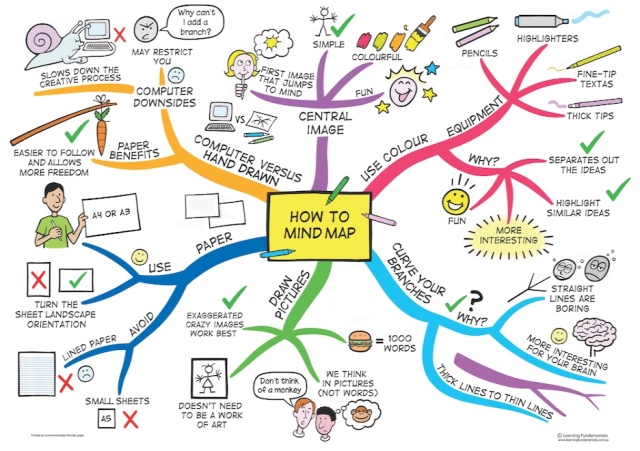
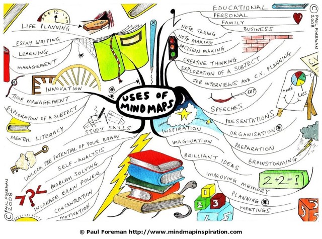
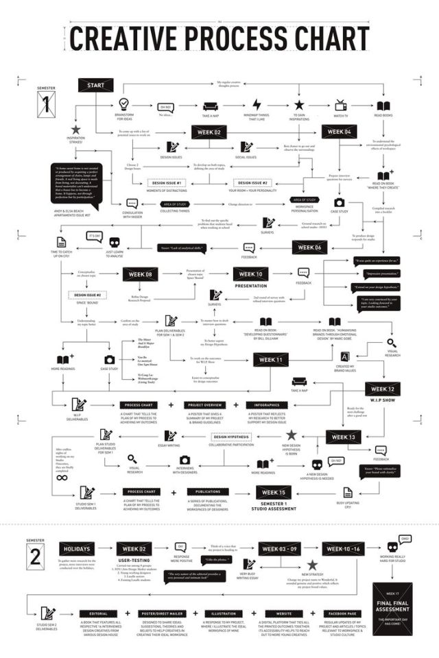
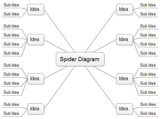
The first session of the term focused on mind maps. This is a way of processing & proceeding ideas to aid & focus creativity.
There is a range of idea-generating techniques, including flow charts, circular leading ideas, spider charts, thumbnails & text. I have to admit I have my own particular way of processing out my creative outcomes, so it would be interesting to take a look at this process & see if it could help in any way.
While researching this process, I came across a selection of ways to create mind maps.
Here are some other examples I found online:
These are only a small selection, so will be interesting to see which method will inspire the best results.
After the subject of mind maps was covered, Ria continued the day’s session with an introduction to semiotics. As Ria explained, now that the class had got to grips of the basic languague of visual communication, now it was time to learn the grammar & start constructing sentences.
Semiotics is “the study of signs & symbols and their use or interpretation”. (1) There are many ways this particular area of study & interpretation can be used to decipher cultural products, especially when deconstructing signs & symbols in all forms of visual communication such as paintings, advertising & films. However, to keep it simple at this stage in the course & for the purpose of this particular unit I will focus on photography & its deconstruction. This also an exercise to get to grips with the language involved & how to apply this theory to interpreting the images of others & my own work.
With regards to signs, there are two main parts (according to Swiss linguist & semiotician Ferdinand De Saussure):
Signifier: the physical presence of an object within a photograph.
Signified: the meaning of the concept which the signifier refers to by the receiver of the sign.
The signifier can also be called an iconic reference – a chair is a ‘chair’. An apple is an ‘apple’. There can also be an indexical reference within an image. This doesn’t show the object itself, but a evidence of an object or something that’s made a mark. For example, a footprint on a beach is evidence of human activity on the beach. This is a more subtle way of looking at a subject. A way to construct a story from an image.
Another way to look at it is through ‘denotation’ (the literal meaning – what you see is what you get) & connotation (the implied meaning). The connotation of an object within a photograph is also subject to cultural sensitivities, so this aspect will also have a bearing on how an image is defined.
That’s an outline of the basics, but as Ria pointed out, when it comes to deconstructing the image, there are other questions to be considered. For example:
Who is the viewer identifying with?
What is this personality likely to be like?
How is the association?
Where is the viewer?
What emotions are associated with this image?
How are they brought about?
What was the artist going through while producing the work? Personal, not cultural
With these basics of semiotics in place, then one can play with elements within an image to change meaning, such as adding an item, removal of an item, exchanging an item or substituting an item.
But before I commence with the deconstruction of the images I’ve started to look at, my next step is to look at colour, which I’ll cover in my next post.
The third & final aspect covered in the class session that day was colour. As Ria explained, colour is an integral part of visual communication – it has its own visual language tied up in physical reactions, symbolism & cultural references that can convey mood, a situation or message within an image.
The saturation or hue can make a difference to a colour’s interpretation & a person’s reactions to it. Colour can be made of ‘tints’ – pastels & lighter colours or ‘shades’ – darker colours.
Colour Symbolism
To illustrate how colours can perceived & be signifiers, Ria put across some succinct bullet points as reminders for the best way to describe them when deconstructing an image:
Red
Brings about a physical reaction
Provocative, stimulating, dynamic
Symbolism: Danger Sex Blood
Deeper tones: rich, refined, expensive, more authoritative, lush, opulent, elegant
Pink
Pale pink – fresh, young
Associated with ‘sweetness’
Darker Pink
Subdued, mature
Mauve (Blue Pink)
Sentimental
Soft
Orange
Hot
Vital
Energising
Inviting
Blue
Safe,
Conservative
Calming
Teal/Turquoise
Unique, weird, out-of-the-ordinary
Yellow
Sunshine, warmth, light, cheerful, mellow
The only colour that gets brighter as it gets more saturated
Eyes see yellow before any other colour
Cool yellows perceived as sour
Green yellow are unpopular in the west but all including green yellows are acceptable to Asian culture
Brown
Rustic, natural, organic
Traditional, historic, old fashioned
Nicotine
Green
Nature, fresh, refreshing, clean, cooling
Can have negative connotations (when someone looks ‘green’ when ill)
Purple
Rare
Royalty
Weird
Exotic
Opulence
White
(yes, this is a white block of colour):
Pure
Innocence
Clean
Clinical
Empty
Untouched
Black
Severe
Glamorous
Austere
Sophisticated
Can also connote luxury depending on the object
The main aspect I took away from this is how colour can convey a mood or message within a photograph. It also gave me more food for thought on how I deconstruct images moving forwards & developing my ideas for this particular project.
Instead of a session at college this week, the class was instructed to use the day for gallery visits to seek inspiration. Having looked at some options, I decided to go to the Saatchi Gallery. I’ve visited it a couple of times before to see various exhibitions & never have I been disappointed by what’s on display. The installations are always well-thought out & the space itself isn’t imposing giving a very accessible atmosphere. It’s definitely one of my favourite London galleries.
The main exhibition on during my visit was Iconoclasts (Art Out of the Mainstream) which features thirteen contemporary artists including:
Maurizio Anzeri
Matthew Chambers
Daniel Crews-Chubb
Josh Faught
Aaron Fowler
Danny Fox
Makiko Kudo
Dale Lewis
Thomas Mailaender
Kate MccGwire
Renee So
Douglas White
Alexi Williams-Wynn
The concept behind the exhibition is to show the work of a group of contemporary, non-mainstream artists who produce experimental pieces that challenge the concept of iconoclasm & representation.
As Donatien Grau (a French cultural commentator) writes in the introduction to the catalogue of the exhibition:
“This exhibition invites us to engage anew with what iconoclasm is to be, & allow us to sense three major forms of timely iconoclasm – beyond the old dichotomy between “image-breakers” & “images-slaves”. (1)
According to Grau, these three forms are:
Their relation to the public sphere
What lies within the image itself
The process of weaving, conceived as a relational aesthetic
That’s the general concept. But what about the work on display? Whose representation of the image would catch my eye & inspire? These are the four that did:
Maurizio Anzeri
The first body of work that really got my attention was that of Maurizio Anzeri. Born in Italy in 1969, Anzeri’s artistic practice is sewing into old found photographs with thread. According to the Saatchi Gallery, he blurs the boundaries between abstraction & portraiture, photography & pictorialism. (2)
Round Midnight 2009
Yvonne 2011
Marcel 2011
Profile Yellow 2012
Nicola 2011
Robert 2011
Mia 2014
Profile Pink 2012
Penny 2009
Rebecca 2009
Rita 2011
Leopold 2014
Lille 2011
Giovanni 2009
Anzeri states:
“In my work photography is becoming a 3D sculptural object. My embroideries on photographs ‘liberated’ themselves from the limits of flat surfaces and they are occupying the space in their entire sculptural dimension. I come from three generations of fishermen & I have seen men using threads & needles all my life. As a kid, I used to spend so much time looking at them repairing & fixing fishing nets on the sea front. Those rituals & meticulous gestures are deeply ingrained in my mind & imagination. For me, embroidery represents a different way of drawing with threads, rather than pencils. It is an alchemic process of obscuring & revealing, erasing & enhancing.” (3)
The work itself is quite small (especially in comparison with the other works on display), presented in either black or white frames (with one interesting exception which I will come to later). The images were hung equi-distant at what could be considered at “eye-level” in a linear display around the four walls of the room.
When I first started looking at these images what I found very interesting was how the colours & lines of the thread play with the aesthetics of the subject in the original photograph. The threads interrupt the lines of the face, reconstructing the composition of the features such as eyes, ears, teeth, mouth & hair.
Because of the size & detail involved, you really have to get close to appreciate & take in the details. These images really drew me in. When looking at these images & attempting to deconstruct them, they need to be seen & examined in three different ways:
The image within the photograph
The patterns & colours of the thread
The combination of the two
With regards to the first aspect, the photographs are described as ‘found’. They do seem to be from a particular era, as they are all (with one exception – see below) black & white with that certain sepia tone photographs get with age. The cultural indicators of hairstyles & clothing aren’t contemporary & can be pinpointed to particular eras. For example, the young girl with the doll is wearing a dress that would have been worn in the late 40s or early 50s. The poses of the subjects themselves are very conventional which suggests these were professional studio shots.
The second aspect is the thread itself. The colours are quite elegant & classy. The tones are muted & rich. When seeing these images on the wall, the light picks up the glossy surface of the thread that adds to this effect. With regards to the lines, the patterns aren’t random & look like they’ve been meticulously planned.
As for the third aspect, this is how the combination of the photograph & thread create a whole new image that plays with the expected conventions of a portrait & gives out other signifiers. For example, this particular work of Anzeri’s reminds me of John Hurt’s depiction of John Merrick in the film version of The Elephant Man.
cof
The other image that struck me with another cultural likeness is this one, which evokes David Bowie in his Ziggy Stardust phase.
Giovanni 2009
This is also the only image on display with a photograph that appears to be in colour. However, it’s hard to tell whether it was originally in colour or coloured after as it is quite faded in tone.
With regards to the images making a social statement, there is a more playful aspect to the work. A parody of a portrait, reconstructing the concept/conventions of how a face should look in a photograph.
As for the most interesting image, which I mentioned with regards to the frame, this one really sticks out from the collection:
Round Midnight 2009 – Maurizio Anzeri
The frame is an older one than the rest – signs of wear, plus the style is more in line with one that would be used with a painting. As for the person within the photograph, the cultural references suggests that this is a young woman from an “exotic” part of the world. It struck me as being similar to the documentary photographs of the Victorian age showing a native of some far-flung colonial country. What I also noticed is that the thread on this photograph is completely black instead of the jewel-like colours of others. It gives the image a darker feel, like a dark veil over the woman’s face, neck, shoulders, arms & upper torso.
Interestingly, in reference to Grau’s third major sign of this new iconoclasm, he states that this
“lies in the process of weaving, conceived as a relational aesthetic: one is no longer to tear the fabric of the world, of art, apart, but to sew it, slowly. The world is a text: a text is textile and has texture. This working may appear to be a joke, but it is in fact very serious, rooted in the deep resources with which language provides us. We read & we feel the world: in our universe of images, we may have forgotten these very simple, very basic realities. Iconoclasm reminds us that we weave our lives, as we live them.
Maurizio Anzeri’s work exemplifies this acceptance: from weaving together – literally – different materials, he invites us to fully feel the multi-layers sensations of the image, to experience them, and, by doing so, to question the given-ness of work perceived as an image.” (4)
I think this is something I’d like to explore further.
Matthew Chambers
The next body of work that took my eye was that of Matthew Chambers, who was born in the United States in 1982. According to the book, he “creates a world of materials & figures, which work together to create an open, poetic narrative”.
The first thing that struck me with these paintings was the size. As Chambers explains:
“I started making the larger 4′ x 8′ paintings because I wanted something bigger than me. I didn’t want to make paintings, as much as I wanted to work for them. Boss-employee, submissive to the wants of the canvas. I couldn’t figure out how to make small paintings that communicated the importance of ‘art-making’ as opposed to the importance of an “art object”. The size allowed me to showcase how I made the decisions that became the painting. Plenty of room to figure out what the painting is about. I standardised the size because I liked that hung together they become cinematic & our minds form narratives between the paintings.” (5)
The image which stood out for me was this one:
I thought the way it was painted was very clever. When viewed up close, it becomes quite abstract:
This reminded me of what Ria was saying about the resulting image of this unit being BIG. Will have to keep this aspect in mind when producing the final photograph.
I also liked the way Chambers has reused old canvases to produce the lined abstracts.
Thomas Mailaender
Another artist’s work on display that also started some ideas brewing is that of Thomas Mailender, born in France in 1979. Mailender had two types of work on show: the first set was of photographs of bodies with other photographs on them, the second a collection of large format cyanotypes of found images. Both sets of images were printed very big & managed to fill the space of the room giving the viewer the opportunity to look at them close up & at a distance.
The first set is of less-than-perfect bodies with other images on them. The exhibition book says that the photographs are ‘printed’ on them. However, it’s obvious his method of choice for these images is sunburn. Mailaender took negatives then shone a UV light onto his subject to create a temporary ‘tattoo’. (6) Maybe I wouldn’t go as far as this for my final image, but the idea was quite innovative & thought-provoking. You could almost feel that prickly sensation you get with sunburn, especially with the angry red on the skin. Not quite the same in black & white.
The other collection on display in the same room was of found images that had been printed as cyanotypes. There is a strong iconography within these, especially with the first one called Electric Jesus. The juxtaposition of a classic crucifixion statue with the cables gives an uncomfortable feeling of humour & unexpected reverence. Also, is this aconstructed image or did someone really put a statue of Jesus on an electrical cable pole?
What also got me thinking about this project are these words from Mailaender:
“I like failure & when things are going in the wrong place. For me, people are beautiful when they are not super fluent.; I prefer the broken over the superb. It’s a good position to be in life when you accept your essential humanness, when you are not trying to be something you are not.”
“I like that art is not perfect – that I can become a geek of imperfection as a way of seeing life.”
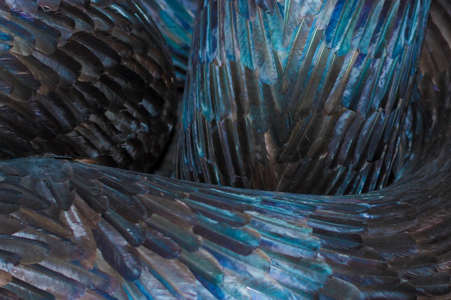
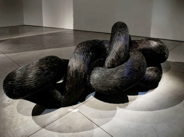
Kate MccGwire
Kate MccGwire was born in the United Kingdom in 1964 who completed her MA in Sculpture at the Royal College of Art. According to the catalogue, MccGwire’s “works may be considered abstract, their structures are organic, & follow the lines of the human body.” (7)
I have to admit when I first saw this work by Kate MccGwire, I dismissed it a black blob sat alongside a couple of other large pieces of 3D work. It was only when I’d looked at it closer that it started to stir me. I didn’t take a photo of the whole work (which is 122 x 331 x 149 cm). This is an image from the gallery’s page dedicated to the piece:
What I first noticed was the feathers – apparently, 20,000 of crows’ feathers were used on the surface of this structure. I then noticed the organic shapes that started showing themselves when I looked closer. I tried to photograph these views with my Nikon D5500, but I wasn’t getting the image I quite wanted. To see what would happen, I popped up the flash. Wow, what a difference.
I realised that the lighting in the room wasn’t making the most of the natural beauty & structural colour of the feathers. Also, after the session on deconstructing colour, my mind went back on what black can convey: dark, heavy, solid, austere. I tried increasing the colour saturation & vibrancy with the following results.
It certainly gives a different sensation looking at the purples & teals – quite ethereal.
The most notable aspect of this piece is the juxtaposition of what a feather is usually associated with – light, delicate, ‘fluffy’, flight, air. The feathers are almost ‘transformed’, into something heavy, metallic, strong, solid. In the catalogue, it also suggests that MccGwire’s forms ’embody a distinctly visceral sense of unease at the world’ (8)
In an interview with the Evening Standard, MccGwire said:
“This sculpture is a writhing form. It is sort of clenching itself like you would see an eel or a snake ball. I sort of think of this work as being a manifestation of a state of mind, slightly angsty, smothered – it’s lots of things mixed together.” (9)
In the catalogue, Kate:
“I’m constantly trying to create this fine line between desire & disquiet: the forms are bodily, so we recognise the creases & crevices, yet they are alien & strange. The work uses natural patterns to suggest familiarity & truth, but they are impossible creatures. These aren’t actual things, though; they’re more akin to a feeling of suffocation or tightness, or the manifestation of an emotion. The intention is to produce something that can be read on many levels, a Mobius strip of both form & meaning.” (10)
I have to admit that this certainly was a thought-provoking experience, both visiting the exhibition & writing it up afterwards. There are certain ideas that have already becoming clearer that I want to explore further. Am looking forward to reconvening with my classmates & Ria to get the creative process really underway.
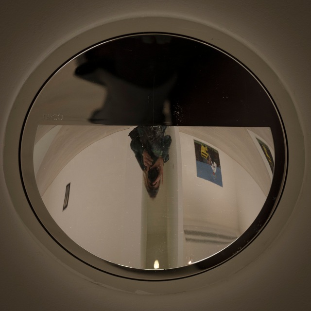
One last photo… couldn’t resist a bit of an abstract selfie, taken via one of the light reflectors in the gallery.
References
Iconoclasts: Art Out of the Mainstream by Donatien Grau 2017.
Iconoclasts: Art Out of the Mainstream 2017 pg 44.
Iconoclasts: Art Out of the Mainstream 2017 pg 44.
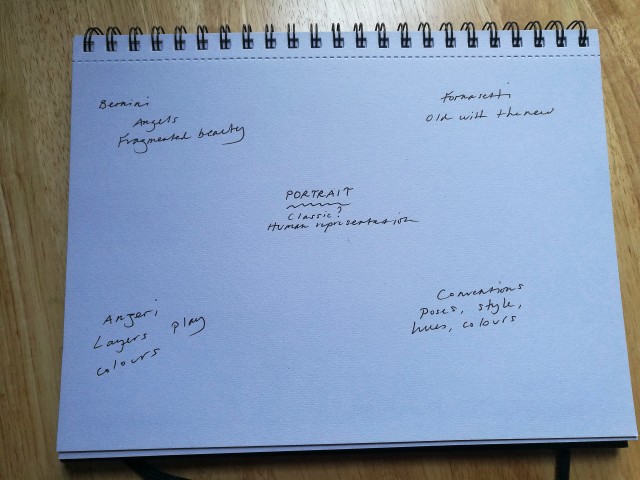
With lots of museum visits & inspiration starting to kick in, time to commence my mind map for this project. After my visit to the Saatchi Gallery, I started to make some notes in my sketchbook. This is the initial draft.
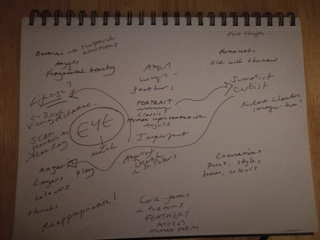
This is the page after my class session on the 25th January 2018.
So, what could I make of this?
For some reason, PORTRAIT was the central word. Something was niggling & pushing me to do this. I certainly have had a creative spark set by Anzari’s work. How a portrait can be changed through the mix of media. There’s a certain surrealist/Cubist influence to Anzeri’s appropriated portraits. The thought of using the eye/mouth as a focal point could be interesting.
If I am going to do a portrait, it had to be big – life size.
Feathers – this seemed to be featuring, especially after discovering Kate MccGraw’s work. Feathers & a portrait. Layers. Colours. Incomplete beauty. Angels.
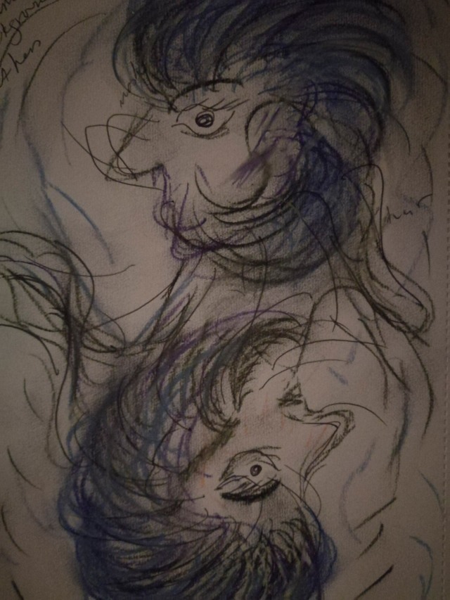
When I got home later that day, drew the following sketch. The bus ride home was an opportunity to formulate some ideas – this was my first step on getting something onto paper.
With an idea sparked, I decided to buy some feathers. The main issue was where do I get them from? I didn’t want any that where unethically (& illegally) sourced. I ended up resorting to eBay, ensuring the seller wasn’t contravening the Wildlife & Countryside Act 1981 (1). The seller I found stated this & that the feathers were “the by-product of a licensed game keeper & vermin controlier & have not been sourced purely for the purpose of this auction”.
I ordered 60 small crow feathers & eagerly awaited their arrival. I was a bit disappointed at first, as they were a lot shorter than I thought they would be. Instead of about eight inches, they were mainly about four. Also, a few of the feathers didn’t totally smooth out. Not to worry at this stage, they would be good to experiment with. These are the first shots after I took them out of the packet.
The first three were taken with the camera flash, the last without.
A bit disappointing. Then I edited one of the images, going through the workflow I had started to use in the previous unit.
Interesting. The colours & textures of the feathers were becoming more visible. Also, I quite liked the little imperfections. Makes them a little more interesting.
Next step is to research about the best way to photograph feathers & edit the images.