A Star Is Born

After a wonderful two-year journey of photographic discovery, I’ve taken the plunge by taking on the Pearson BTEC Level 4 HNC Diploma in Photography.

According to the college’s description, this two-year course at Richmond Adult Community College provides a specialist work-related programme of study that covers the key knowledge, understanding & practical skills required in the photography sector.

The course is structured around a series of projects. These will include visual communication & ideas generation techniques alongside a range of photography and studio techniques, including the use of moving image.

Context will also be a key aspect of this qualification where I will study cultural history that informs current thought & debate within art, craft & design. The emphasis will be on research & study skills where I will acquire source material & knowledge.

I will develop my knowledge of visual language through the evaluation of the work of other artists, craft workers and designers, & interpret the meanings & messages from particular art & design movements & also in the work of individual artists, craft workers & designers in and outside the world of photography.

I’ve already successfully passed the Photography NCFE Level 1 & Level 2 Awards plus awarded the Pearson BTEC Level 3 Certificate with triple distinction.

The blog covering Level 1 & 2 is:

https://jenniemeadows.wordpress.com/

My Level 3 blog is

https://photopersephone.wordpress.com/

So, why Photo Arcturus?

While thinking of a name for this body of work, I wanted something that reflected my current state. Then a friend posted a photograph of star called Arcturus, taken on Brighton Beach at night. I’ve not heard of that star before. Having researched both it’s cultural & mythological meanings. I thought it an appropriate name for this blog chronicling my journey over the following days, weeks & months.


photo_arcturus_jennie_meadows

Unit 1: Pt 1 Unit Outline

The aim of this unit is to develop my skills in generating & communicating ideas visually.

During this unit, I will:

  • Be expected to develop an understanding of the role & responsibilities of the artist, designer & craftworker in a commercial context & to acquire the ability to communicate ideas through photography & other visual techniques & skills
  • Explore the visual & tactile properties & characteristics of materials
  • Investigate contexts & demonstrate the ability to select & interpret research information through design development – this will necessitate me having practical first-hand experience in manipulating materials to meet requirements of briefs
  • Show a level of practical competence in studio & workshop practice combined with evidence of an awareness of relevant safe working practice
  • Gain a thorough understanding of design practice, relevant legislation, including health & safety, public liability & copyright law
  • Keep records of all professional practice (meetings, attendance, punctuality, contracts, etc.) & provide evidence of the correct use of terminology & vocabulary in written & oral presentation
  • Gain a thorough understanding of contemporary professional practice & guest speakers, workshops, visits to design studios & appropriate exhibitions will contextualise practical studies


Learning Outcomes

On successful completion of this unit, I will:

Learning Outcome 1: Covered by Task 1

  • Be able to communicate ideas & concepts by researching visual techniques
    • 1.1 Research visual communication techniques
    • 1.2 Evaluate visual communication techniques
      • Evidence:
        • Primary &/or secondary research material
        • Documentation of choices in preparation for photographic approaches in my blog
        • Reflection & explanation of choices in my blog


Learning Outcome 2: Covered by Task 2

  • Be able to select visual communication techniques to realise creative intentions
    • 2.1 Identify creative intentions
    • 2.2 Select visual communication techniques to effectively realise creative intentions
      • Evidence:
        • Select & refine ideas in my blog
        • Research & explore visual communication, technique & selected contact sheets processes in works-in-progress
        • Reflect on these in my blog


Learning Outcome 3: Covered by Task 3

  • Be able to produce work which demonstrates the use of visual communication
    • 3.1 Apply visual communication techniques to mycreative work
    • 3.2 Justify the visual communication techniques used in my creative works
      • Evidence:
        • Complete & document ideas in my blog
        • Produce contact sheets, works in progress, & final images & up-to-date technical file
        • Complete a short artist’s statement


Learning Outcome 4: Covered by Task 4

  • Understand the potential for personal development through the application of new approaches to visual communication
    • 4.1 Evaluate the use of visual communication in own work
      • 4.2 Propose new approaches to developing own work through the application of visual communication techniques
      •  Evidence:
        • Documentation in blog of the above tasks
        • Sketches/thumbnails & up-to-date technical file
        • Presentation of project development including final photos & statement
        • Peer & self-evaluation of completed project

Unit 1: Pt 2 Time & Tide T 2

In preparation for the start of the course & to get our creative juices flowing, the class received an email from our tutor, Ria Stochel.

Hi All,

Can you bring into the first session that you will have with me on Friday afternoon 15th September :

Images you have taken in the past or can take over the next few days that illustrate or capture in a personal way that resonates with you

One of the following words:

  • Beneath
  • Relationship
  • Deconstruction
  • Broken
  • Growth

The images can be brought in on a drive/memory key or be prints.

Thank you

Ria

Hmmmm. Have to admit, I wasn’t in the right frame of mind to start thinking ‘creatively’. It had been a long Summer that didn’t involve a holiday of any kind. However, I knew I had to start at some point, so I gave it a go. I decided to bring some images from my Level 2 course entitled The Postcode Project. This was to illustrate my ‘growth’ as a photographer & the progress I’ve made.

Sure enough, I was rumbled. During our first class session with Ria, I knew that this wouldn’t cut it. My other classmates had made a bit more effort. For example, Carolyn’s delicate observations of her elderly father’s garden depicting the gradual decay of an untended space. Also, Petya’s beautiful photos for her final Level 3 project, Transformations. When they were compared to her images from an earlier project, you could see how Petya had developed & expanded on a unique technique & concept. I knew that I couldn’t just present a bunch of old pics under a pretext of a clichéd cop out.

Then I mentioned I’d taken some photos the Saturday before – would the class like to see them?

Yes, was the answer.

I’d recently taken a trip to Rotherhithe, London, to visit the Brunel Museum & see an installation by artists Anne Krinsky & Tom Pearman called Tide Line Thames.

This was a collaborative projected installation screened in the museum’s Thames Tunnel Shaft. Running for 15 minutes, the film merges Anne’s video footage of the River Thames with Tom’s animations.

According to Anne’s blog piece on her website (1), Anne’s images focus on the river’s architectural structures between high and low tide lines. Tom’s animations are of faux tunneling forms, inspired by Brunel’s Tunnel and Tunnel Shaft. The collaboration was a culminating exhibition of Anne’s two-year project which was supported by Arts Council England.

Anne met Tom on the New Creative Markets Programme, a mentoring scheme jointly funded by SPACE studios and the European Regional Development Fund. As their practices shared a passion for architecture and geometry, she learned a lot from this collaboration. Anne worked with video for the first time for this project and received technical advice and support from Levin Haegele and London Creative Network, a follow-up mentoring programme for artists working in new mediums.

This is why I knew I had to see this installation, especially with my own obsession with the River Thames. This was also a place in London I’d never visited before.

The Thames Tunnel shaft is a unique London structure. It’s quite wide & deep, with soot -covered, pock-marked walls. When I arrived, Anne was just setting up the projection with the help of her husband. This was my first impression taken with my mobile phone’s camera.


I made my way down the stairs to see it straight on. It was quite transfixing looking at the video images & how they played with the overlaying animations. I then took some photos with the Nikon D5500 DSLR.


While taking in the images & taking photos, I had the pleasure of chatting with Anne. During the conversation she mentioned that there was a second part of this exhibition that I could see over in Canary Wharf. Called Tropical Thames, this installation consists of large-scale digital prints on aluminium panels that was created especially for & placed within the Crossrail Place Roof Garden.

Guess where I was off to next…

The Crossrail Place building, designed by Foster & Partners, is a weird & wonderful piece of contemporary architecture. Resembling a permanently anchored cruise ship, it tops one of the Crossrail stations. Filled with bars, cafés, a cinema, bike shop, offices & other facilities, it’s definitely a ‘living’ building rather than just another City office block.

The building’s Roof Garden is a great space – bit of green in a block of grey. Anne’s Tropical Thames certainly brightened up the garden on a dull day.

As with Tide Line Thames, the imagery is inspired by the architectural structures of the River Thames. Anne has combined & manipulated colour, texture & composition to create some quite memorable pieces.

After taking in these bright flashes of colour, I then started making my way round the building & captured some observations.

Later on that day, I had a play with some of the images & came up with the following. All I’ve done is given them a basic black & white conversion with a neatening crop.

These are the images I showed to Ria & the class.

After a positive response & some constructive criticism, I felt ‘back in the game’. The word that Ria suggested these images responded to was Beneath. The image that brought this out was the black & white version of the Tide Line Thames photo. You can see the texture & shape of the tunnel shaft’s wall coming through, adding an extra dimension ‘beneath’.

As Ria pointed out, this may not be something that can be utilised for the first Unit’s project, but could be filed for future reference. I think I’ll definitely be exploring this at some point during the course.

1: https://www.annekrinsky.com/

http://www.brunel-museum.org.uk/

http://www.crossrail.co.uk/route/stations/canary-wharf/

Unit 1: Pt 4 Research Begins

Landscape photography. What does that phrase initially emote in me? Generally, when I think of that particular photographic genre, images of chocolate box scenery & long-exposure shots of piers sliding off into the distance on a smooth sea usually come to mind. Usually taken by men with exceedingly large lens on solo trips to the wilderness.

When looking at this particular style of landscape photography, sometimes these hyper-coloured images start merging into a rainbow of beauty. They become a show of skill rather than having an individual flair. But that’s my personal reaction. I know there are other ways of emoting a landscape photographically.

As part of the unit’s outline, the class has been given a list of contemporary photographers as sources. My first task is to research three of these then analyse how the compositional & technical approaches in my example images help the photographs communicate their intended objective.  To do this I’ll look at the works of Simon Norfolk, Edward Burtinsky & Murray Johnston.

Simon Norfolk

Simon Norfolk is a landscape photographer who themes his work around the meaning of the word ‘battlefield’ in all its forms. He has photographed supercomputers used to design military systems, test launches of nuclear missiles plus captured some of the world’s worst war zones & refugee crises (1). While researching Norfolk’s work, the images that have always stood out for me are the ones involving trees & details featured in a series of images: Bleed.

When first looking at Norfolk’s work, especially if you’re unaware of the context, they could be described as general observations of a landscape with a few abstracts thrown in for good measure.

For example, the images of the trees are quite conventional. They are presented in quite a classical way, in that the trees are central to the images. Each could be seen as a study of how changes in the light & surrounding environment appear to show the differences of the seasons. The mountains in the distance show a deep depth of field, giving the viewer a sense of space & perspective.

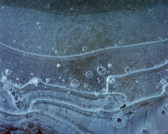
The abstracts appear to be studies of ice, taking in a detailed view of the patterns within the frozen water. The viewer is taken in very close, almost to the point of claustrophobia. With regards to all the images, the colours are very muted & the images are both sharp & in focus. They are not presented in a very sentimental way & are quite stark.

However, these photographs have a more bone-chilling history. These landscape images were taken in Bosnia on the sites of a mass grave along a pot-holed track through the country at a place known as Crny Vrh. (2). By recording this site in its apparent mundanity, Norfolk has created a record of an horrific war crime.

Edward Burtinsky

Burtinsky’s work is a body of images that I’ve admired since coming across it at Photo London in 2016. These photographs when seen printed & framed on a wall just make you stop & stare. There is a real sense of detachment when viewing these photographs, as if you’re being suspended in the sky looking down observing the landscape from afar. At first, with some of the images, it isn’t obvious as to what the subject matter may be. The viewer has to then take a much closer look to see the details. This brings the viewer deeper into the image, enticing them in.

There is also a contradiction between the beautiful aesthetics of the saturated colours & sharp details being presented & the stark truth of the subject matter. Burtinsky has stated that ‘nature transformed through industry’ is a predominant theme of his work & that ‘these images are meant as metaphors to the dilemma of our modern existence’ By taking on subjects that are rich in detail he captures environments such as recycling yards, quarries & refineries. His intention is to show the dilemma of our modern existence, the ‘uneasy contradiction’ of our ‘dependence on nature to provide the materials for our consumption & our concern for the health of the planet’.  (1).

Burtinsky has certainly achieved his objective by recording the results of humans transformation of certain parts of the environment in the pursuit of acquiring objects. Each image shows the massive scale of that transformation, giving the viewer the opportunity to reflect on the impact of its effect.

Murray Johnston

Murray Johnston (1949 – 1990) was a Scottish photographer who, in his short, but influential, career was the first photographer in residence at Kielder Forest, Northumberland in 1980. (4).

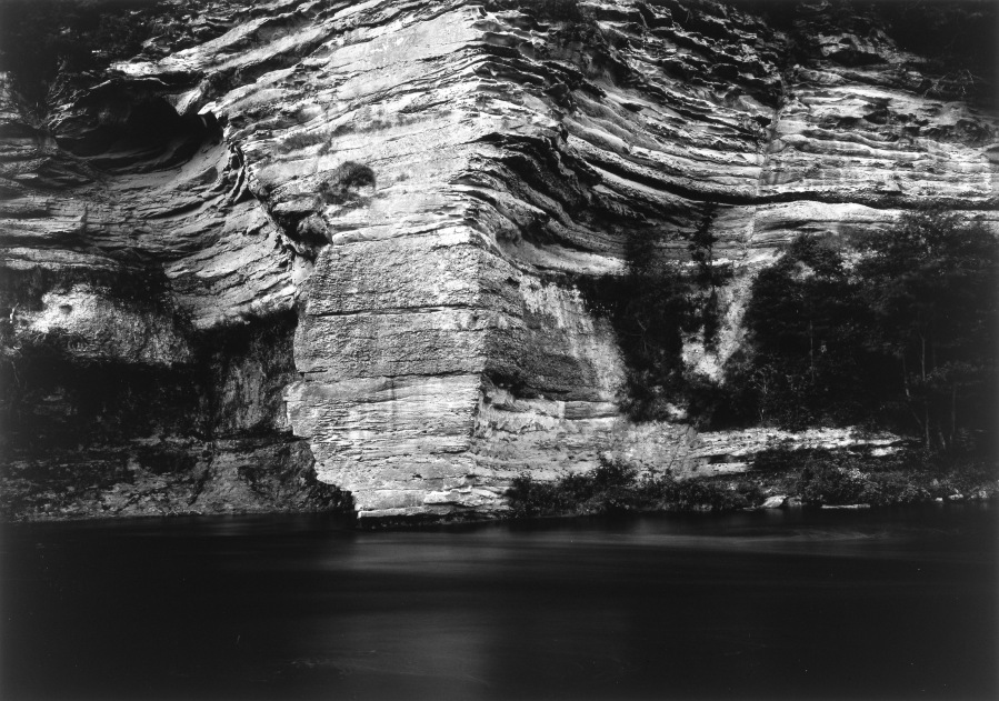
In contrast to the other photographers above, Johnston’s landscape photography appears to be in a more traditional style. By this I mean it is a literal a record of an environment, rather than a commentary on the circumstances in which the photograph was taken. Also these are taken on black & white film then printed in a darkroom rather than taken with digital cameras then produced on a colour printer

When looking at his images there is a noticeable softness of tone without any sacrifice of detail. The point of view is quite intimate, as if the viewer could be in the forest, on the beach or by the river. The compositions are never quite straight, giving a slightly off-set feel to the images. However, this does not distract from the gentle beauty within the photographs. The trees are quite a solid presence within the setting adding weight & structure.

With the images of the grass & trees, there are leading lines that bring the viewer’s attention to the depth of field. The trees to the side of the grass in both photos are quite heavy in comparison to the grass in the bottom middle which accentuates the effect.

It’s a shame that I haven’t been able to see the prints in real life rather than on the screen. Ria pointed out that these images have been printed on platinum rather than silver-based paper. This gives even more detail to the images by adding a particular tone adding to the extent of contrast without being too harsh.

Now that this particular task is complete, time to dig a bit further into the genre of landscape photography.

1: https://www.michaelhoppengallery.com/artists/69-simon-norfolk/overview/

2: http://www.instituteartist.com/feature-Bleed-Simon-Norfolk

3: https://www.edwardburtynsky.com/

4: https://www.nationalgalleries.org/art-and-artists/artists/murray-johnston

Criteria Ref: Tasks 1.1 & 1.2


Unit 1: Pt 5 Brighton Bokeh

On the Sunday after our first session I visited Brighton beach. It was a gloriously sunny Autumnal day. I was spending it with a fellow photographer, taking in the sea air & looking for a bit of inspiration.

I was using my 50mm lens, but it wasn’t doing much for me.

brighton_beach1920.jpg

My friend then took a lens out of his bag & fixed it to my camera. It was a Tamron SP 500mm 1:8. This is a mirror lens which my previous tutor, Zig, had shown us, but I’d never used one before. Put simply, it’s a cheaper version of a long-focal lens (£300 compared to £1k+).

What got me was when I put the lens on the camera, all functions were manual. Have to admit, I do quite rely on aperture priority & focusing. It suits my style of shooting, plus helps with my dodgy close-up eye sight. However, my friend was on hand with friendly advice on how to use it.

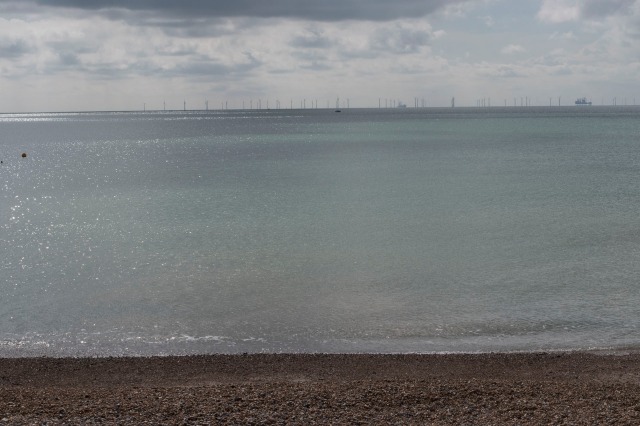
The first thing he mentioned was I’d have to put up the ISO, so I did. I then started to look at the world with my new ‘eye’.  The first thing that caught my attention was the reflection of the sunlight on the water.

Hmmmm, a bit over-exposed, so I reduced the ISO. I then took some consecutive shots while holding the camera as still as I could. None of the following have been edited.

I wish I’d taken some interval timer shots of this – would have made a great time lapse/dissolve piece similar to my last BTEC project.

I try to take some further shots, but my blurry, close-up vision just couldn’t cope.

Will take a bit of practice to get it right if I borrow the lens again. What I did like about using it was getting out of my comfort zone. Think I need a bit more of that!

When I got home later that day, I had a tweak with one of photos. Can imagine this printed on fine art paper. Something else to explore.

brighton_bokeh_01_1920

Ok, today wasn’t the best for photography, but it got me thinking about the current project. It was quite freeing just looking & experiencing rather than worrying about getting the ‘perfect’ shot. I caught the following on my phone’s camera:

My friend also captured me at work:

These are all reminders of a wonderful day that I’ll treasure forever.

Criteria Ref: Task 2.1

Unit 1: Pt 6 Genre Deconstruction

As I mentioned previously, when thinking about landscape photography a certain type of image comes to mind. However, there are different categories within this particular genre. The class spent a session looking at these with Ria giving examples of which photographer came under each category. The main concept of what Ria was conveying is that ‘Landscape’ isn’t about pretty pictures & wide open spaces. It can be broken down into a multitude of styles & sensibilities.

I have to admit that reading my notes after this session, it was a big whirl of names, images, concepts, thoughts & discussion. There is also crossover between the categories. The following is combination of my notation from the session & the resulting research. At this stage of this project, I’m assuming a Minor White position of being ‘Hunter & Gatherer’, waiting for that lightning-bright moment of inspiration.

The initial categories of Landscape that Ria outlined are:

  • Geographical
    • Visual recording of the landscape
  • Indexical
    • Traces of human intervention – cut trees, mines, paths
  • Autobiographical
    • Personal relationship with the landscape
    • Author’s narrative’
    • Reflective of a person’s feelings
  • Metaphorical
    • Literal or more personally symbolic
    • Breaks the mould
    • Feeling & inspiration

One could take these as the literal definitions of the categories. But these can then be broken down into particular areas:

There are those who depict ‘environmental concerns’, showing impact on the environment. This can be of either natural or man-made effects. There are those who add a human element, where a person can become part of the landscape itself.  There can be survey photography which can catalogue a particular territory. These can include the inner city, suburbia, rural places, the countryside & national parks.

Other spaces to be captured are the ‘edgelands’. As Ria explained, these are areas that fall at the borders of different territory types, usually areas of transition. These can include industrial areas, ring roads & brownfield sites.

The other main aspect of landscape that caught my attention is the autobiographical & metaphorical categories. The thought of an evocative & emotional reaction resonates highly with me. How I react to an environment certainly has a palpable impact on my own photography.

After the session, I went back through the list of names & took a closer look at some of these photographer’s work:

Jonathan Olley

Don McCullin

Jem Southam

Robert Adams

Walter Niedermayer

Elina Brotherus

Murray Johnston

Thomas Joshua Cooper

While carrying out my research, my preferences were becoming clear. I certainly prefer the black & white landscapes. Clouds are coming into focus. Lines & tones. I really liked the work of Murray Johnston, especially after Ria explained that Johnston produces platinum or palladium prints rather than silver. Apparently, this gives his work an exquisite quality which sets it apart from other black & white pieces. I would love to see the prints in real life – I’ve always appreciated the visible difference between black & white digital prints & and film ones. So, to see a further contrast is intriguing.

When a colour landscape is involved, it’s the stark ones that drew me in, such as the work of Brotherus. Also, I liked the way the photographer becomes an aspect of the landscape itself & is an integral part of the composition.

Now with a better idea of what constitutes as ‘landscape’ photography, it was time to take some photos.

Criteria Ref: Task 1.1 & 1.2

Unit 1: Pt 7 Painshill Park

Armed with an extended vocabulary of what constitutes as landscape photography, it was time to put words into images. As my previous forays into this particular genre have either involved local parks or city areas, I thought I’d venture to a place constructed to be a beautiful landscape – Painshill Park.

According to the website, Painshill Park is “a Grade 1 listed 18th century landscape garden was created in the naturalistic style between 1738 and 1773, and was the artistic vision of the Honourable Charles Hamilton, 9th son and 14th child of the 6th Earl of Abercorn.” (1)

The garden was “inspired by Renaissance and contemporary art and visits to Italy on the Grand Tour, the Hon. Charles Hamilton decided to create a tranquil landscape setting enriched by follies, water, trees, shrubberies and a vineyard.” (2)

I visited with my fellow photographer who had brought along a few of their Nikon-compatible lenses for me to try out. This was to be a day of wandering & observing.

Here are the results:

50mm Lens

Tamron SP 500mm 1:8 Mirror Lens

Tamron SP 35mm F1.8 Lens

Back to 50mm

Mobile Phone Shots

I have to admit I didn’t feel too inspired that day. The light wasn’t right & the gardens were in that no-mans land between the end of Summer & Autumn. None of the above were edited.

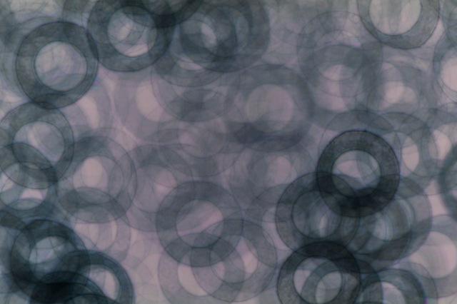
However, when looking at the images later that day, I couldn’t resist a bit of abstraction from one of the tree bark shots:

painshill_park_50mm_014_blue_1920

My fellow photographer also took some shots of me in action:

I’m going to have to take a different approach…

  1. http://www.painshill.co.uk/about-painshill/history/
  2. http://www.painshill.co.uk/about-painshill/history/

Criteria Ref: Task 2.1 &2.2


Unit 1: Pt 8 London to Paris

My next foray into landscape photography for this project literally involved a bit of a journey. I recently completed a bike ride from London to Paris with St Margarets Cycling Club.

One aspect of this trip was being able to experience several landscapes in a short amount of time. During the ride, I took in many sights, sounds, smells of the environment. Some pretty, some ugly, some downright disgusting & depressing. I have to admit that I didn’t experience moments of absolute beauty, but there was definitely lots to think about.

Instead of lugging round my DSLR, I took my compact Pentax. Easier to slip into a cycle jersey pocket. Plus, it’s water & drop proof. Here are a selection of photos.


Time on the bike gave me time to think. I’m sure my thoughts will be added to the mix.

Criteria Ref: Task 2.1


Unit 1: Pt 10 The Photographers Gallery & Gregory Crewdson

On Friday 6th October 2017, the class took a trip to London in order to visit a selection of galleries. These were:

  • The Photographers Gallery
  • Beetles & Huxley
  • White Cube Mason’s Yard
  • The Royal Academy of Arts
  • Royal Opera Arcade Gallery

The purpose of the visit was to expose us to a range of photography, artworks & galleries then note our observations, conclusions & emotional reactions to the work. We then had to analyse these responses through deconstruction.

Ria had provided a very useful list of pointers to help us ‘pick apart’ and reverse-engineer how, as an individual, I was being affected/or how I was being helped to arrive at my conclusions when viewing a work.

As there were five galleries in total, I’ve split my observations & responses into separate blog posts. While looking through my notes & looking at the photos taken during the day, I realised that it was going to take quite a long time to sift through everything. I will be posting the blog entries with images then add the text as & when I can.

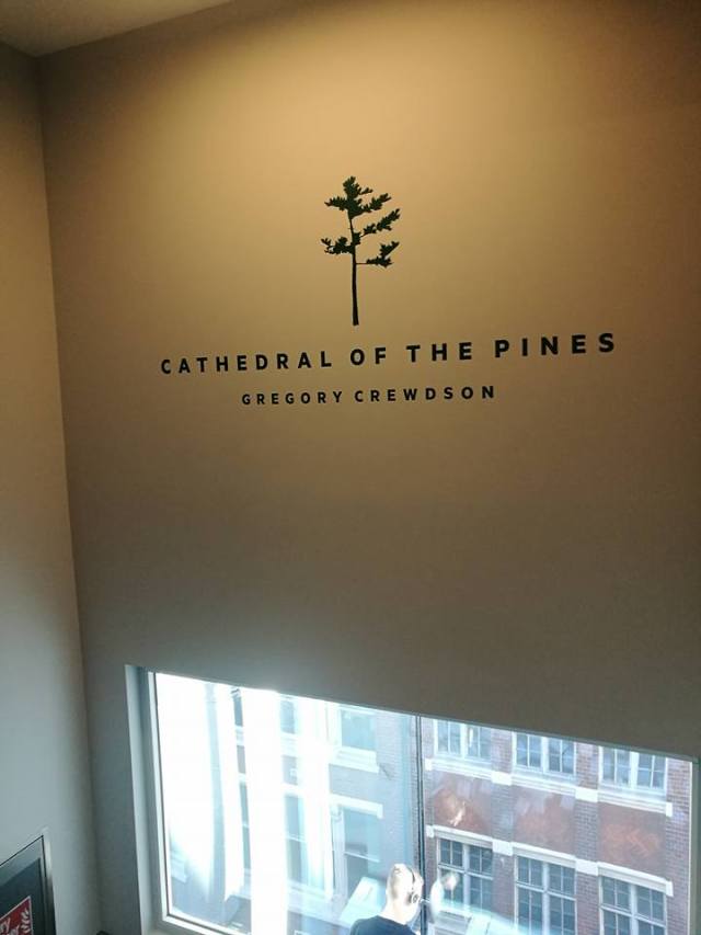
The class met up first at The Photographers Gallery to see Gregory Crewdson’s ‘Cathedral of the Pines’. I’d visited this gallery two times before, so was quite familiar with its layout. The gallery didn’t quite shout that the exhibition was on, but quietly suggested this with the following posters in frame in its café:


The exhibition itself was set over three floors in the gallery. I decided to walk up the stairs. Interestingly, the exhibition ‘started’ on the fifth (& top floor). This meant that you were being directed to the top of the gallery & had to work your way down. I supposed there was a logic to this. Would I notice when viewing the work?

While walking up the stairs, I noticed this on the wall. The gallery uses this space nicely to ‘announce’ the work. I remembered other exhibitions being highlighted in this way.
photographers_gallery_gregory_crewdson_03

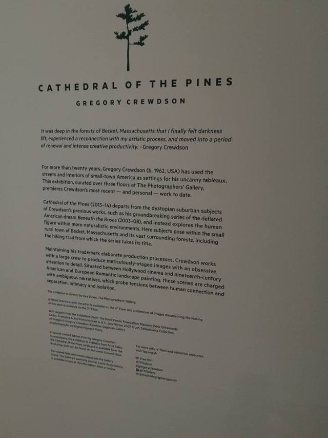
I finally got to the fifth floor, where the following information was there to be read:
photographers_gallery_gregory_crewdson_05

I was slightly aware of Crewdson’s work previously – my classmate Mary has a strong dislike for his work & always gives a ‘shudder’ whenever he’s mentioned. I was reserving judgement until I could see them for myself.

My initial reaction was to take a photo with my mobile phone’s camera of the pieces on display. A literal depiction of what was on display.


I then started to observe the framed prints within the gallery setting & the people viewing them. By doing this, I could reference the print’s size & how they’ve been put on the walls. Looking back, I noticed that these have been hung what appears to be quite low on the wall with a lot of space above. Looks a bit odd, considering the ‘dead’ space above the frame. But when seen with people, they are set at an ideal height for close observation.


I have to admit that by the time I’d gone round the first floor of the exhibition, I wasn’t overly impressed with what I was seeing. The images didn’t ‘grab’ me. I was annoyed with the typical spot lighting & reflective surfaces. The framing was the cliché black square. Disappointed, I walked down the two flights of stairs to the next gallery space.


Again, the same stripped spotlights. The same frames. I then started looking a bit closer. Especially after my classmate, Joanne, made some very pertinent observations about the following image. I also remembered a comment made by Ria about how a photographer can ‘lead’ the observer by manipulating the image in certain ways.

Seated Woman on Bed

CREWD-2013.Seated-Woman-on-Bed

My first real observation was the contrast between the seated woman & her surroundings. She was crystal clear. The surrounding image looked like an oil painting – smoother, less defined. Then I noticed all the smaller details. Then it hit me – nothing in this image is ‘accidental’. There was a myriad of messages, some shouting, some whispering. It was up to the observer to make of these as they will.

There was a real sense of loneliness, despite the presence of another person, albeit hidden. Only a hint of toe & outline of a leg under the bedding shows someone there.

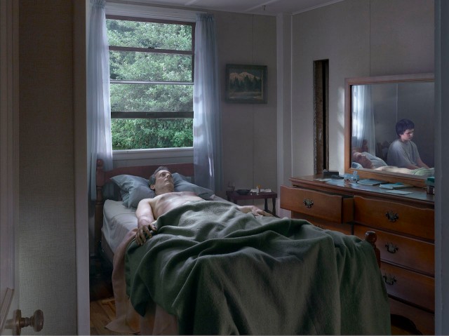
Father & Son
Gregory-Crewdson-Father-and-Son-2013

This was one of the most disturbing images in the collection. There was no indication that the man lying in the bed was actually alive. It was as if he’d just died, unnoticed by his (presumed) son. Again, closer observation revealed what was on the bedside chest of drawers & table, including  a military badge, a pot of pills, a bible – pages marked with bits of paper, one half of a ‘walky talky’ plus a dog-eared map. All remnants of a lived life.

Woman At Window
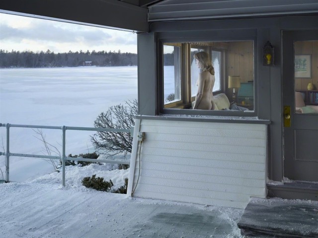
Gregory-Crewdson-woman-at-window-2014

Another image of loneliness – as if the internal setting is as ‘cold’ as the external.

While walking round, I took a look at one of my favourite parts of The Photographers Gallery – the wall where visitors’ comments on the exhibition are posted. Here are few of these:

Got me thinking more about the photos.

Woman in Living Room
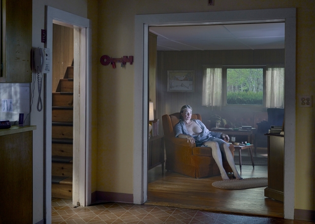
160302_CG_CREWD-LivingRoom.jpg.CROP.promo-xlarge2.jpg

Yet again, another domestic setting of solitude. But instead of looking out onto a landscape, the woman is watching through a different window – the television. One can imagine her looking at images of a world completely different from her own, escaping the drab existence of her day-to-day life. Or she could be watching those less fortunate & thinking ‘glad I’m not in their shoes’.

The Den
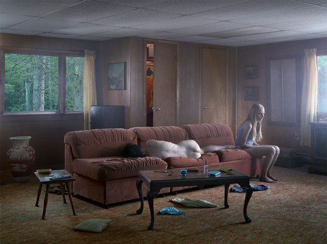
den.jpg.CROP.original-original

The first thing that strikes when looking at ‘The Den’ is the young woman perched on the sofa. Then my eyes were drawn to the rest of the room. One thing I did notice was the ageing polystyrene ceiling tiles – nicotine-stained & shabby. So glad I wasn’t able to smell the atmosphere in that room. Can imagine it had an ingrained stench of cigarettes, body odour & damp. Also, the figure lying naked on the sofa wasn’t quite obvious at first glance. It suggests a young male lover sleeping off a passionate session while the girl is having regrets of what she’s done.

Woman on Road
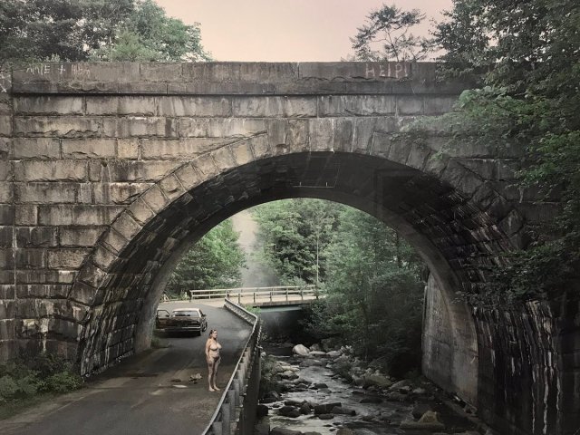
crewdson_-woman-on-road-2014.jpg

This image was probably the most ‘literal’ of those on display. Almost as if capturing the moments of this woman in the peak of a nervous breakdown. Having driven to a secluded place, got out of the car then discarded her clothes. What is she about to do next? Jump into the shallow river to drown herself? Collapse into a ball of weeping & waling on the road? Or scream, like Sally Bowles in Cabaret, under the bridge? Was she Amie? Did the + person (who’s name can’t quite be read) dump her? Is she crying for “HELP!”? Or did she go back to the car, get a pack of cigarettes discarded on the passenger seat & light up a fag? Who knows…

The Shed
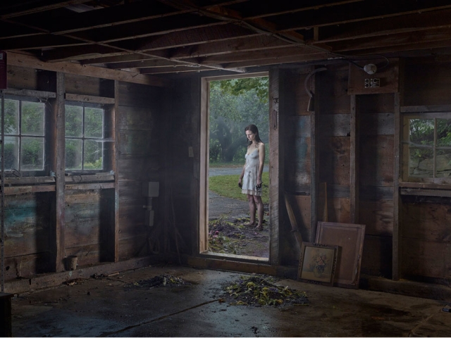
crewdson_-the-shed-2014.jpg

By this time, I was starting the tire of deconstructing the actual images. There was only so much my mind could deal with. However, my observing eye changed its chain of thought. Instead of focusing on the perceived narrative, I started to notice the differences when taking photos of sections of the prints with my Nikon D5500 DSLR. My observation was how these shots exposed the details further than in the print on the wall. It just highlights the amazing nuances of these images.

The Barn

crewdson_-the-barn-2014

Again, more detailed shots with the DSLR. Again, more observations. What struck me with The Barn is when the close up shot reframes a composition. It turns a slickly constructed porteau view into an intimate portrait.

Telephone Booth

What got me with the following images is not the total, but the details. I was drawn to certain aspects, highlighted by the photos I took.

The Quarry

Interesting. By now my brain had pretty much burnt out. The following is a few more shots taken with the DSLR within the gallery space.

Observers Observed

Criteria Ref: Tasks 1.1 & 1.2